Broadband provider Cuckoo aims to ruffle feathers with new branding
Studio Output hoped to inject “an element of fun” into Cuckoo’s new look, setting it apart from other broadband companies.
Studio Output hoped to inject “an element of fun” into Cuckoo’s new look, setting it apart from other broadband companies.

The Intellectual Property Office is reviewing the UK’s IP system so we asked designers about their own experiences in accessing and using it.

As well as making the brand more recognisable on the shelf, the tea company’s new colour palette and illustrations aim to appeal to a younger audience.

As part of our coverage of 2022’s graduate season, we’re talking with a selection of graduates from around the UK about their work, practice and future plans.

Interabang attempts to distinguish this set from previous stamp collections through “abstract illustrations” and “shards of colour”.

A quirky canal house in Amsterdam and a luxury travel experience feature in this month’s interior design picks.

As part of our coverage of 2022’s graduate season, we’re spotlighting graduates from around the UK to find out about their work, practice and future plans.

This year’s awards champion social design projects that aim to tackle specific environmental and community issues.

Prince Rupert’s Tower has been drawn from the crest to work alongside it as an “anchor for the new design system”.

Bulletproof studio added bright hues of colour to Toblerone’s visual identity as well as a bespoke, archive-inspired typeface.
The report reveals that the current system may be negatively affecting smaller design companies.
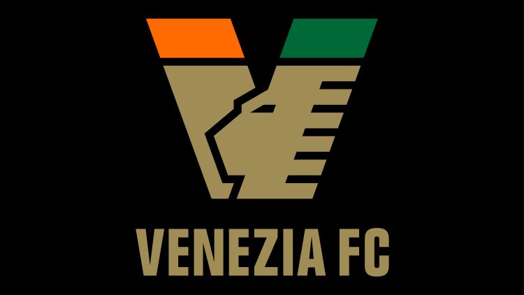
Its legacy as “the world’s most fashionable football club” is reflected in the new 2022-23 kit collection.

We’re excited to announce the new Design Week editorial team ahead of the platform’s relaunch this autumn. Rob Alderson joins as Editor, with Clare Dowdy as Senior Writer.

It is with great sadness that we heard about the passing of the hugely influential British designer, Sir Kenneth Grange.

As we head back into our archives, here’s a gem from March 1990. Jane Lewis looks at the creative ways design firms promoted their services through mail-outs.

During our pause, we’re re-publishing the occasional article from deep in our archives. This March 1990 column by our founder, Jeremy Myerson, looks at car design trends.

In December 2023, it was announced that Design Week was closing its doors. However – good news! We’re reopening by the end of summer 2024!

As the design industry propelled itself forward, we were always there to champion, inform, analyse and guide the way.

Have you been paying attention for the last four decades? Only one way to find out.

Design Week closes, having championed design excellence for the past 38 years.

As part of our series on design in 2024, WeWantMore creative director Ruud Belmans offers his view on what retail and experience design might look like next year.

As part of our series on design in 2024, Studio Arc director Lyndsey Bowditch offers her view on what exhibition design might look like next year.

As part of our series on design in 2024, Mia Blume – founder of Design Dept. and Designing with AI – tells us that next year will be a “paradigm

Taking the form of a ‘vagina-like’ tent, INTER/her by Camille Baker uses cutting edge tech to open up conversations around issues like ovarian and cervical cancer, endometriosis, and menopause.
